Direct translations of Japanese lists or items within the same hierarchy often overlook a crucial detail in English writing: parallel structure.
Parallel structure means aligning the grammar and form of each item in a list or group to ensure consistency. Literal translations of such items may reflect the original Japanese structure, but a lack of parallel structure can feel confusing or jarring in English.
High-quality English requires more than accuracy. A clear and consistent structure guides readers smoothly through key points, helping global audiences understand the information without hesitation.
Non-Parallel Structures
At OWL, we often see Japanese reports use non-parallel structures in lists and groups of phrases. Using a mix of verbs, nouns, gerunds, and other parts of speech in the same list may be acceptable Japanese writing, where readers can typically understand the message based on context. But English does not work the same way.
Inconsistent structure appears uneven and reduces readability, leading to communication issues in investor relations documents, where clarity and consistency are essential.
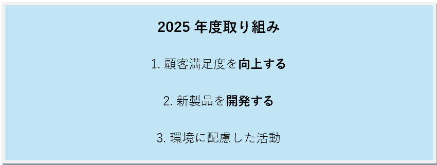
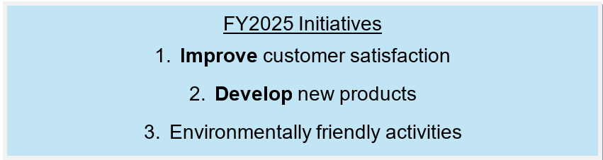
Take a look at the following Japanese-language example.
How would you translate this list? A direct, non-parallel translation might look like the following:
Take a look at item #3. Unlike the first two items, the phrase environmentally friendly activities does not include a verb. A missing verb here can be jarring to English readers, who may wonder what action your company intends to take regarding these activities.
Do you intend to engage in environmentally friendly activities? Increase participation in such activities? Start engaging? Continue current activities?
Ensuring parallel structure can support quick reading, reduce misinterpretation, highlight priorities clearly, and build trust through polished communication.
Items Within the Same Hierarchy
Items within the same hierarchy do not always appear as lists. A good example of this is a company’s materiality. Materialities have become a common reporting element across sustainability reports, ESG disclosures, and IR documents.
When laying out each materiality, ensure each item follows the same tense and grammatical structure, even if located in various similar areas throughout your report.
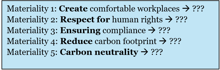
Let’s take a look at the following materialities.
Does each materiality use parallel structures? Or can you identify a mix of plain verbs, noun phrases, and gerunds? If there is a mix, how might you fix it?
If you answered that the materialities are not parallel, you would be correct. But how can you best fix this issue?
There are three simple approaches you can take.
Convert all plain verbs and gerunds (verbs taking “-ing”) into noun phrases
Convert all noun phrases and gerunds into plain verb phrases
Convert all nouns and verb phrases into gerunds
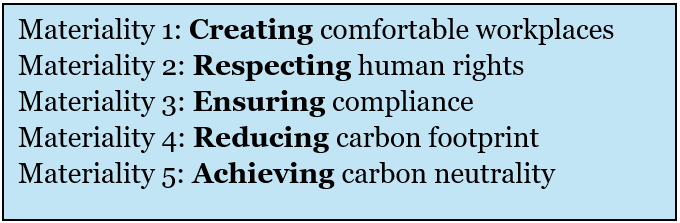
Let’s take a look at the following edited materialities.
Would you say the items in this group are parallel? The correct answer is yes.
Note that in my revision, I changed all forms into “-ing” verbs. Whether you revise your list to begin with plain verbs, “-ing” verbs, or nouns can boil down to preference, style, and even context.
The Takeaway
Literal translations can miss structural signals that matter in English. Ensuring parallel structure in English translations can lower miscommunication and ensure the intent of the Japanese is translated clearly.
Parallel structures across lists and items within the same hierarchy can also create a polished tone that supports trust and credibility with global investors through a clear structure that strengthens your message.
For support in creating consistent English writing, contact One World Link today
Integrated reports and sustainability reports carry significant responsibility in telling your story to a global audience. These documents communicate strategy, purpose, and progress to both domestic and global stakeholders, and every section contributes to the larger story that your company wants to tell. The key to shaping the story readers take away is the theme, or overarching message, that guides them through the report.
A theme isn’t just a cool slogan on the cover of your report. Instead, a theme should support your company’s values, philosophy, and the message of your overall report.
When the theme shifts from section to section, readers can struggle to understand the overall direction. Using a consistent theme will help keep your reports coherent and create a clear message investors can follow from the first page to the last.
A consistent theme can also only improve readability and enhance credibility. Investors expect companies to communicate with clarity, and a strong theme demonstrates intention and alignment across the organization.
Themes Across Sections
Consider the following example headings commonly found in an integrated report.
Cover Innovation for Growth
CEO Message Creating Stakeholder Value
ESG Section Building a Sustainable Future
Looking at these headings, readers might assume that each section discusses a different concept. Although all three sections may introduce valid talking points, the shift in focus can distract readers and make your report feel fragmented.
Below is an example of what a more consistent theme might look like, centered around the theme of innovativegrowth.
Cover Innovation for Growth
CEO Message Innovative Growth Builds Shareholder Value
ESG Section Innovative Growth Leads to a Sustainable Future
These revised section headings now link each message back to a single theme, creating not only consistency throughout the different sections but also strengthening the image that your company is fully dedicated to innovative growth.
When each section develops the same core idea, the entire report feels more intentional. Your theme supports the strategic story, and readers can see how leadership, ESG initiatives, and long-term ambitions connect to the company’s growth narrative.
This article on Storyraise (run by Storyraise Technology Inc.) discusses a multitude of reasons why developing a theme for your integrated report is absolutely crucial. In particular, Storyraise comments on the following benefits.
Themes…
Help tell a story
Humanize your brand
Help deliver an impactful message
Help you and your readers stay on track
Help affirm your brand
Help differentiate your report from years past
The article also states that without a theme, “…readers won’t feel like they’re reading a story. Instead, they’ll feel like they’re reading a textbook or a boring financial report.”
In Summary
Strong IR and ESG reports rely on a clear thematic direction. When each section supports a consistent idea, the writing carries a stronger message that resonates more deeply with readers and strengthens your global message.
One World Link can help refine theme structure, align Japanese and English narratives during translation, and improve readability across your IR and ESG materials. Contact us today for a free English Translation Quality Assessment Report (https://www.oneworldlink.jp/satei.php).
One World Link では、テーマ構成の整理、日本語と英語のメッセージの整合性確保、読みやすさの向上など、統合報告書およびESG関連資料の質を高めるお手伝いをしています。 無料の英語翻訳品質診断レポートもご利用いただけます。 https://www.oneworldlink.jp/satei.php
No one can deny that Japanese and English are about as different as two languages can be. From the seemingly “backwards” sentence structures to entirely different reading directions, the two feel like polar opposites.
Did you know English text can take up to twice as much space as Japanese? Imagine trying to cram all that extra text into tiny graphs, headings, or design elements. The struggle is real, and translators often need to get creative.
But today, I want to focus on one specific pain point that’s truly a headache—vertical text.
Vertical Text: A Reader’s Nightmare
Vertical text is a staple in Japanese design, but when it comes to English? It’s a recipe for confusion. Here’s why:
Reading Flow Disruption: English readers are used to scanning left-to-right, top-to-bottom. Vertical text forces them to pause and tilt their heads, breaking their rhythm. Some readers may skip the text altogether due to not being accustomed to such formatting.
Misinterpretation Risks: Vertical text and its placement can lead to misinterpretation in financial reports, manuals, or other complex documents as readers are accustomed to left-to-right flow. Vertical text may cause confusion about what data the label refers to or whether the information is a heading or a side comment.
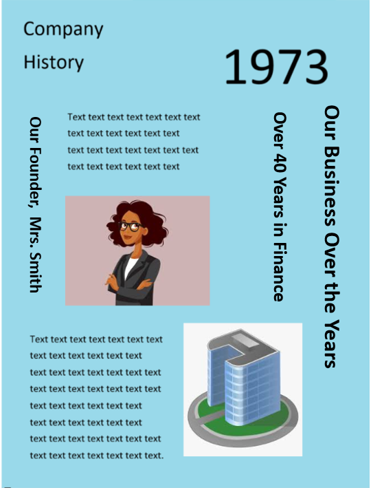
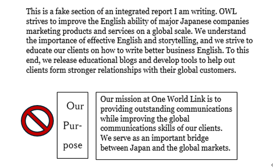
Take a look at this example page I created from a hypothetical integrated report.
Figure 1
With excessive use of vertical text like this, English readers are almost forced to break their next to read your report.
(True story: I once had to edit an 80-page integrated report full of vertical headings just like this. Imagine trying to read 80 pages like this!)
One study posted in the Journal of Vision found that reading speeds of vertical text drops significantly compared to horizontal text. (Journal of Vision)
While readers may be inclined to force their way through a spot or two of vertical text, an entire 80-page report is another story entirely. Readers may decide that reading such material just isn’t worth the hassle.
Your readers—global investors—expect reports that are easy to navigate. Vertical text can slow down their understanding, making them less confident in your materials.
When Vertical Text Can’t Be Avoided
There will, of course, be times when vertical text is unavoidable.
Oftentimes, when text reaches the translation stage, it’s too late to make any major changes to the design.
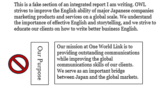
So what can you do? Let’s take a look at Figure 2.
Figure 2
Notice how Our Purpose faces the outside of the page?
You may think this is the correct way to print vertical text in English, given that English text is read from top to bottom.
But as you may know, where there is a rule in English, there is almost always an exception.
If I underlined Our Purpose, that line would be facing the blank area, away from the text it should be heading. This makes it seem as if there is no relevant text under the title.
It’s best to rotate such text clockwise or counterclockwise to ensure that any unavoidable English text faces the relevant body text, even if it means not all titles face the same direction.
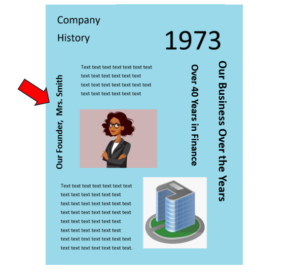
Let’s look back at Figure 1.
Figure 1 (Revised)
Even though the revised heading reads bottom to top and is different from the other headings, the heading now points to the correct information.
Tools like Adobe InDesign and Microsoft Word offer features to align vertical text more effectively. Use these to tweak layouts without redesigning from scratch.
Another option you may have is widening the space allotted and using horizontal text, but this depends heavily on space.
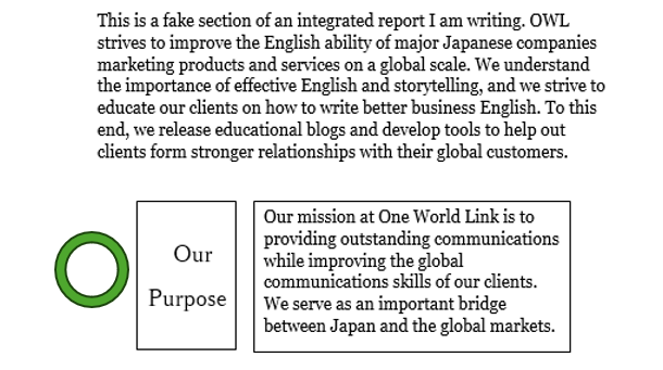
Figure 2 (Revised)
Only take this option if each word if you are able to do so without breaking up single words over multiple lines of text.
Figure 3
The Takeaway
Don’t lose readers to avoidable design flaws.
Remember: Your English-language report may be the first touchpoint global investors have with your company. If a label or title feels unclear, unnecessary, or awkward to read, readers may feel less inclined to continue reading and learn about your company.
Avoiding vertical text, or adjusting its orientation thoughtfully, isn’t just a design decision. It’s part of building trust. And for IR professionals, ensuring your reports meet global readability standards is essential. Take the time to audit your layouts and make small adjustments to vertical text where possible.
Before submitting your report, check for:
Vertical text that disrupts reading flow
Misaligned vertical headings
Alternatives like rotating titles to face the relevant body text
And if possible, collaborate with your design team early to ensure layouts accommodate both languages. A small conversation now can save significant headaches later.
In the world of investor relations and global communications, we sometimes become so focused on what we need to communicate that we forget to consider how best to convey our messages. Writing clear, professional English isn’t always about what you say, but how you present the information. The structures and format of your English text greatly affect how easily readers understand your message.
One technique professional business English writers use is to break information into clear, organized sections. For many overseas readers, long blocks of text can be tiring and difficult to follow. Whether you’re preparing an investor presentation, a shareholder letter, or a corporate report, dense paragraphs can cause readers to lose focus and miss key points.
To make your writing clear and engaging, try using bullet points and numbered lists. These tools help you present key information concisely and guide readers through your main ideas—an essential skill for anyone managing global corporate communications.
Why Bullet Points and Lists Work
Overseas audiences prefer concise communication.
Many English readers tend to skim through text, especially in business contexts where time is often limited. They want to find key information quickly and clearly.
Bullet points and numbered lists help transform dense information into a structured, easy-to-read format. These structures not only improve readability but also give your writing a more professional and polished look, making it easier to communicate complex ideas to overseas stakeholders.
Here are just a few benefits:
Visually appealing – Breaking up text with bullets or numbers creates breathing room on the page. It’s easier on the eyes.
Quick to read – Instead of forcing your audience to sift through a paragraph, bullets deliver the highlights instantly.
Easy to understand – Lists make it easy to organize complex ideas or multiple points in a way that’s simple to follow.
For non-native speakers, bullet points also simplify writing, reducing the chance of misinterpretation and ensuring the message is clear
Consider this example:
Our company adheres to multiple standards and recommendations, including the Task Force on Climate-related Financial Disclosures (TCFD) guidelines, the Global Reporting Initiative (GRI) standards, the United Nations Sustainable Development Goals (SDGs), the International Integrated Reporting Framework (IIRF), and the recommendations of the Sustainability Accounting Standards Board (SASB).
VS
Our company adheres to the following standards and recommendations:
Task Force on Climate-related Financial Disclosures (TCFD)
Global Reporting Initiative (GRI)
United Nations Sustainable Development Goals (SDGs)
International Integrated Reporting Framework (IIRF)
Sustainability Accounting Standards Board (SASB)
See the difference? This information just became way easier to digest with bullet points!
Buller Points or Numbered Lists?
Use bullet points when the order of items doesn’t matter. Research by Ho (2023) found that bullet points enhance the reading experience by helping readers absorb information more quickly and with less effort. For example:
Breaking down a long list into bite-sized information
Summarizing main ideas
Highlighting the most important information
Choose numbered lists when the sequence or ranking is important. They work well for:
Simply throwing the same long-winded, run-on sentences into bullet points won’t help clarify your message. The entire point of using bullet points and numbered lists is to break down your information into easily digestible bits of information. Too many, and the lists might seem daunting to readers.
Consistency is also key. Mixing verb and noun phrases is not standard in English. Use parallel structure in your bullet points and lists (e.g., if most points begin with a verb, make sure all other points do too). Be sure to also keep lists around the same length. As the article by Clearly Scientific states, “…switching from short text to long text is distracting, and may give a misleading impression of the importance of the entries.”
Ready to Transform Your Writing?
The next time you draft English corporate communications, remember that overseas readers value clarity and structure. Break up long paragraphs, use bullet points or numbered lists where appropriate, and make your messages easy to scan.
While these techniques may not apply in the same way to Japanese writing, they are highly effective in English business communication. Try applying them in your next IR report or stakeholder message.
Our company adheres to multiple standards and recommendations, including the Task Force on Climate-related Financial Disclosures (TCFD) guidelines, the Global Reporting Initiative (GRI) standards, the United Nations Sustainable Development Goals (SDGs), the International Integrated Reporting Framework (IIRF), and the recommendations of the Sustainability Accounting Standards Board (SASB).
VS
Our company adheres to the following standards and recommendations: • Task Force on Climate-related Financial Disclosures (TCFD) • Global Reporting Initiative (GRI) • United Nations Sustainable Development Goals (SDGs) • International Integrated Reporting Framework (IIRF) • Sustainability Accounting Standards Board (SASB)
Is your company incorporating generative AI as part of the DX push to save time and money? Like many companies, you might be using DeepL, ChatGPT, Gemini, or other generative AI to translate Japanese into English. But what’s the state of generative AI Japanese-to-English translation as of summer 2025?
OWL translators are no strangers to generative AI or machine translation. Lately, we’ve noticed some quirks in quality that users should know about.
In this blog post, I’ll share several real examples of odd or problematic translations we’ve encountered. These issues highlight what to watch for when using AI translation tools for Japanese-to-English translation, especially for IR or corporate communications. All examples are taken directly from screenshots we’ve collected.
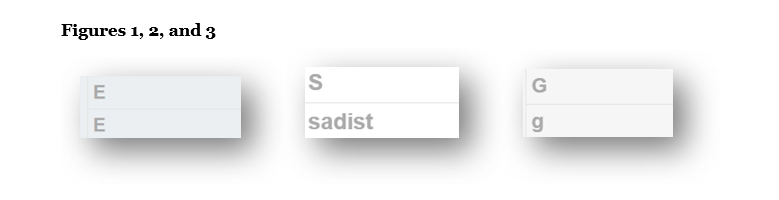
Tip 1 – Don’t skip the simple stuff
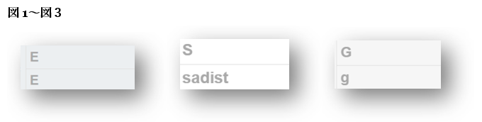
Figures 1–3 show the acronym ESG split across three lines, which led the machine translation tool to render the letters as “E,” “sadist,” and “g.” While no human translator would assume “S” stands for “sadist,” this still raises red flags.
The capital/lowercase inconsistency and the shift from a letter to a word show just how fragile AI output can be, especially with simple formatting quirks. Don’t assume short or seemingly simple content will be handled correctly. Always check for consistency.
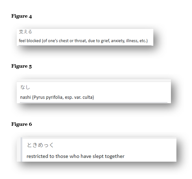
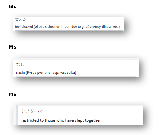
Figures 4–6 show another common issue: dictionary-style output. These translations aren’t technically “wrong,” but they include excessive explanations, parentheses, or wordy definitions that don’t belong in the context of a professional document. In fact, the machine translation used the wrong definitions entirely. The correct translations in context were as follows:
支える→ Support
なし → N/a
ときめっく→ TTOKIMEKKU
Note: In the original Japanese, ときめっく was used as a proper noun (the name of a facility). AI often struggles with proper nouns, fixed translations, and company- or industry-specific terms. Always double-check how these are handled, especially in official documents.
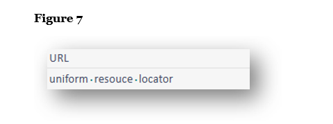
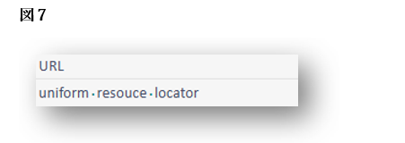
In Figure 7, the translation spells out “URL” as “uniform resource locator,” something rarely done in English. There is no reason to spell this out when URL is the common term.
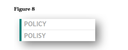
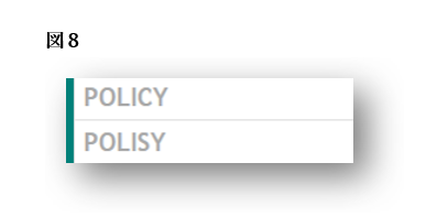
Figure 8, unfortunately, requires no explanation and is entirely unacceptable. “Polisy” is simply a misspelling of “Policy.”
Tip 2 – Double and triple check your numbers
Sometimes generative AI gets numbers completely wrong.
→See our blog here for more examples in English and Japanese
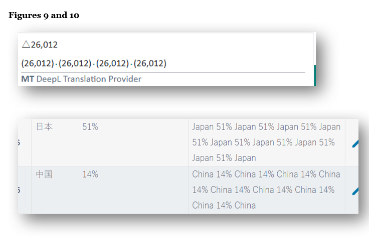
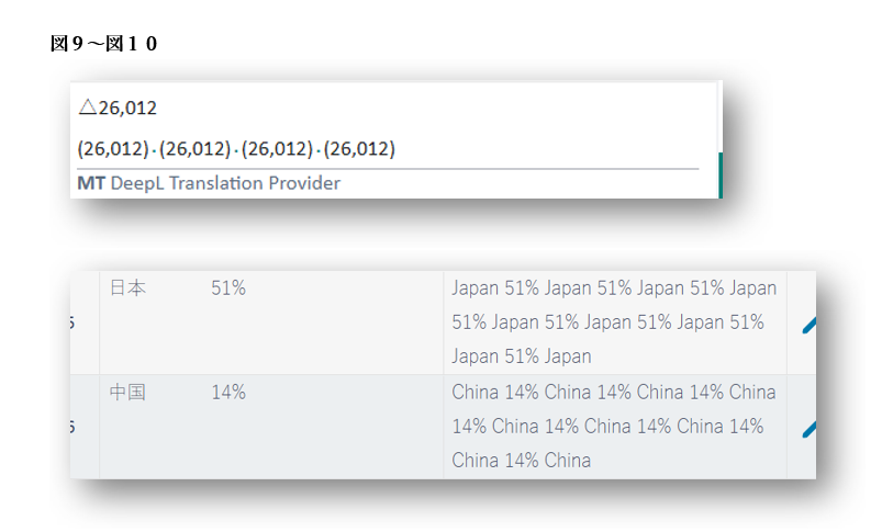
Figures 9 and 10 show examples where the translation tool repeats a number four to eight times. The number itself is correct, but the repetition is not. Always check numerical output carefully.
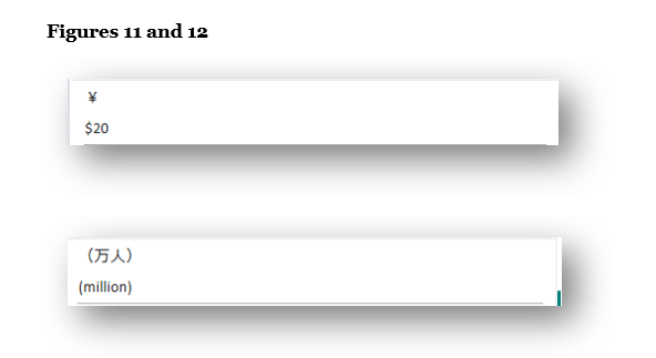
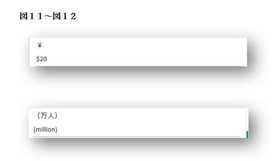
Figures 11 and 12 show more serious mistranslations: ¥ converted to “$20,” and 万人 translated as “million people.” These are easy to catch in isolation but could easily be missed in a lengthy financial report, especially if only the English output is reviewed for grammar, word choice, and natural language use.
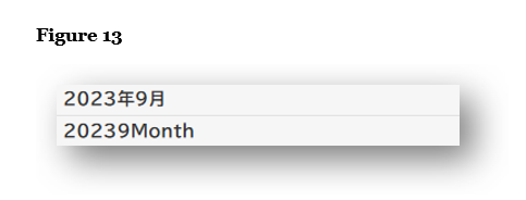
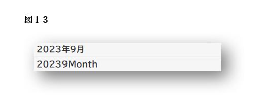
Figure 13 shows a bizarre translation of a simple date. “20239Month” suggests the tool tried to translate each part of the Japanese date individually, then collapsed them into a single unreadable string. This translation is non-standard in the use of “month” as well as the lack of spaces.
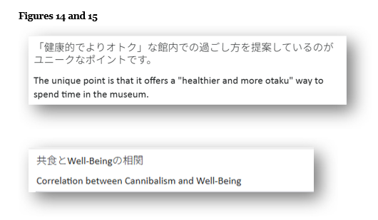
Tip 3 – Watch out for the occasional completely wrong and inappropriate word
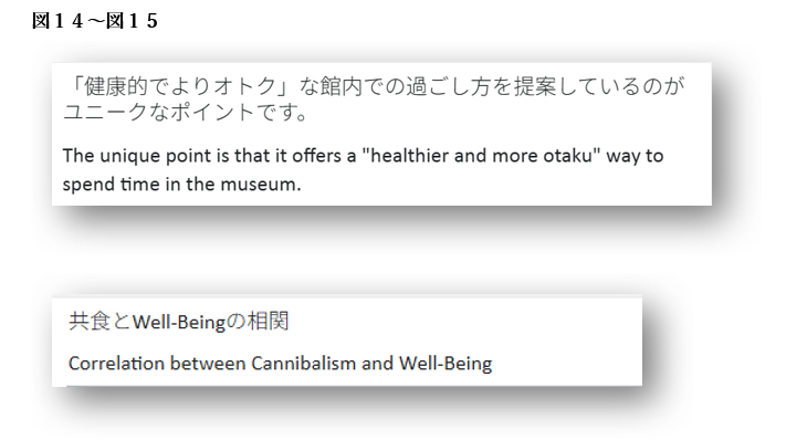
Figures 14 and 15 here depict “otoku” translated as “otaku” and 共食 translated as cannibalism. I probably don’t have to explain why this is wrong. Mistakes like these are potentially embarrassing.
These two examples may be examples of generative AI learning from incorrect or poorly reviewed public translations. As more flawed outputs get recycled into training data, we’re beginning to see these types of errors surface more frequently.
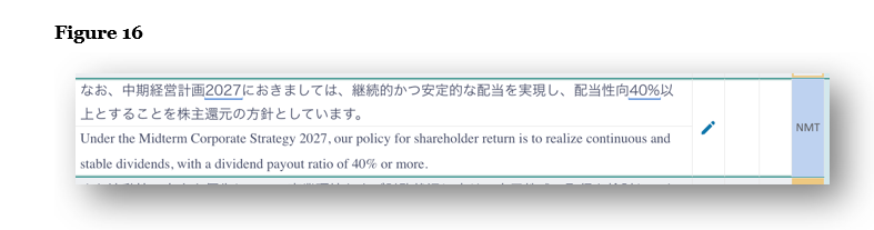
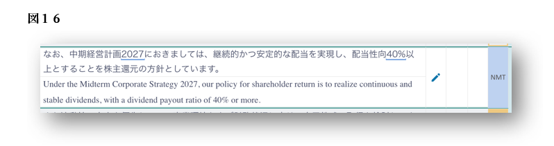
Figure 16 shows 中期経営計画, a term common to most investor relations documents, as “Midterm Corporate Strategy.” The standard English translation for 中期経営計画 is “medium-term management plan.”
First, midterm should be hyphenated when used as a compound adjective (i.e., “mid-term”).
Second, and more importantly, this phrase appears to reflect the official English name a specific company uses for its own medium-term management plan. In other words, the tool has likely “learned” this translation from prior public use, despite it being nonstandard.
In all our years working with generative AI and machine translation tools, we’ve never seen 中期経営計画 rendered as Midterm Corporate Strategy by default. This may be another example of how generative AI draws from real-world usage, including company-specific terms, even when they don’t align with standard or widely accepted translations. If a nonstandard translation is used publicly and goes unchecked, it can be absorbed into the AI’s training data and later offered as a “valid” translation. This reflects a classic garbage-in, garbage-out problem: the more flawed inputs the model is exposed to, the more likely it is to produce flawed outputs in the future.
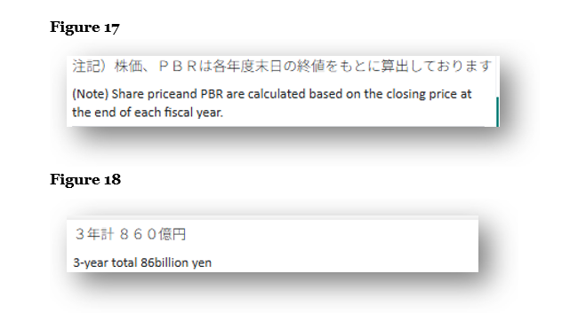
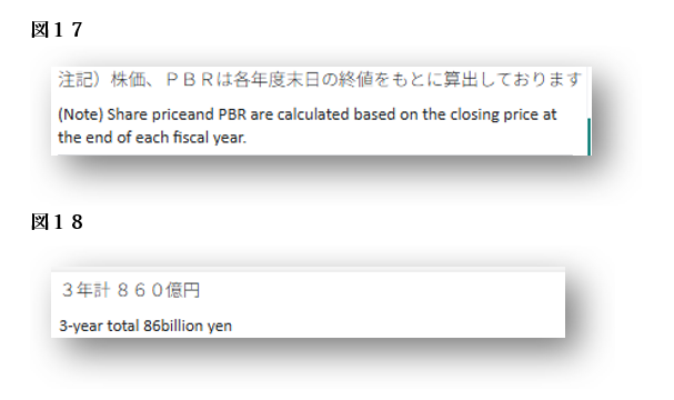
Figure 13 showed how machine translation can omit spaces within a date. Figures 17 and 18 reveal similar spacing issues in full sentences. The sentence in Figure 17 is missing a space between “price” and “and,” while in Figure 18 we are missing a space between the number (86) and unit (billion).
These may seem like minor errors, but they can affect readability and look careless in formal documents. Allow me to also note that, while it depends on context and the style guide in use, numbers under 10 are generally spelled out in body text. Hyphenated adjectives like “3-year total” are typically written as “three-year.”
So why is this happening?
We suspect two reasons for the quality quirks. First, we think that generative AI may be becoming self-referential, “learning” from its own past low-quality output accepted blindly by users. Second, we suspect that the more generative AI learns from translations “in the wild,” the more “garbage” (low-quality) translations generative AI comes to accept as correct examples.
These phenomena align with warnings from data quality experts. As Robert Stanley, Senior Director at Melissa, explains in a recent SD Times article , “If you’re training your AI model on poor quality data, you’re likely to get bad results.” He also stresses that without data that is “accurate, complete and augmented or well-defined… the outputs of the AI model won’t be reliable.” In other words, garbage in, garbage out still holds true.
Stanley also notes that LLMs are often designed to please the user, which “sometimes means giving answers that look like compelling right answers, but are actually incorrect.”
The source and quality of training data used in generative AI and machine translation tools may be to blame for these quality issues as well. As highlighted in recent research published in Nature and reported by the Financial Times, AI models trained on synthetic data—content generated by earlier versions of AI—are at risk of what researchers call “model collapse.” Over successive training cycles, these models can begin to reinforce their own mistakes, leading to distorted or nonsensical outputs. In translation, this could mean that awkward, incorrect, or overly literal machine-translated phrases become embedded as standard over time.
Translation tools are becoming more advanced, but they are still quite unreliable, especially if they are “learning” from flawed or inconsistent public content. Over time, these self-reinforcing mistakes can lead to nonstandard or even misleading translations becoming normalized.
Whether the issue is a small inconsistency, a mistranslated number, or an entirely inappropriate word, even one error can affect the quality and credibility of your translations. It is more important than ever to stay alert to these risks and take steps to ensure the final English reads naturally, clearly, and professionally. If you’re unsure about the quality of a translation, or need a second set of eyes, our team of native English translators can help you make sure your materials are accurate and investor-ready.
このように、非標準の訳語が公開されたまま訂正されない場合、それがAIの学習データに取り込まれ、“正しい訳”として出力されてしまう可能性があります。 これはいわゆる「Garbage in, garbage out(質の低い入力からは質の低い出力しか得られない)」という典型的な問題であり、AIが不適切な入力を学習すればするほど、今後さらに誤訳が増えていくリスクがあることを意味しています。