

(日本語ブログ:フォント次第で印象が変わる?知られざるその重要性とデザインの影響力|One World Link)
How important is your font choice? The answer might surprise you.
Fonts are valuables tools in writing that affect legibility, spacing, and even the perception of your company. The American Profession Guide states, “Fonts hold more power than many realize. They shape our feelings and perceptions in subtle yet profound ways. Understanding this emotional impact can help designers, marketers, and communicators convey messages more effectively.”
In today’s blog, we’ll look at spacing and perception.
Space, for example, is precious in writing—especially when translating between languages as different as Japanese and English. Did you know your font choice may waste both horizontal and vertical space?
When translating Japanese materials into English, space issues often arise. English text can take up twice the space of Japanese, leading to design headaches in graphs, headings, and layouts. Don’t let your font make matters worse.
Is your font optimized for English or Japanese?
Different fonts have different uses. Fonts like MS Mincho, Yu Gothic, and Meiryo are fantastic for Japanese text—but they can wreak havoc on spacing and legibility in English translations.
Let’s take a look at some common Japanese fonts and why they aren’t the best choice for English communications.
Examples of Poor Fonts for English Reports (and Why)
- MS Mincho
- This serif font is optimized for Japanese kanji and kana. Its strokes are too delicate for English, making text look uneven and hard to read in large blocks.
- Issue: Thin lines and poor balance for Roman characters.
- MS Gothic
- Common in Japanese documents, but its blocky English characters feel outdated.
- Issue: Lack of proportional spacing, resulting in an unattractive and rigid appearance.
- Yu Mincho
- While elegant for Japanese text, the Roman alphabet in Yu Mincho can look mismatched due to overly narrow or wide characters.
- Issue: Inefficient use of space and inconsistent kerning (spacing between letters).
So which fonts should you use?
wo of the most common font categories in English are Serif and San-Serif fonts. Let’s take a look at how Carter Printing introduces these fonts:
Serif fonts are traditional body types. Examples include Times New Roman and Garamond. At the tips of their letters, there are little lines called “feet” that make them especially excellent for smaller type. The feet help with readability even at 8 or 9 pts. They are often seen in printed novels and books.
Sans Serif, meaning “without feet”, fonts are increasingly popular. Google Docs’ go-to font, Arial, and Microsoft Word’s automated font, Calibri, are both Sans Serif. The lack of lines at the end allows for a sleek and modern appeal.
(Source: Carter Printing)
Common San-Serif and Serif Fonts
Sans-Serif Fonts: Arial, Helvetica, Roboto, Calibri
Serif Fonts: Times New Roman, Georgia, Garamond
Serif and Sans-Serif fonts ensure professionalism, clarity, and compatibility with English writing standards
But what about tone and perception? The American Profession Guide mentions that we tend to associate serif fonts like Times New Roman with newspapers, books, and other printed formal texts. Sans-serif fonts, on the other hand, tend to be common in digital content as they give off a more modern, clean, and simple feel.
Let’s take a closer look at some of these fonts.
- Arial
- A widely used sans-serif font known for having a clean and modern appearance. Arial is easy to read on both screens and printed documents, making it a reliable choice for professional reports.
- Times New Roman
- A classic serif font that balances professionalism with readability. This font is common in academic and business settings with a familiar structure that makes it easy for readers to process large amounts of text.
- Helvetica
- A versatile sans-serif font valued for its clarity and neutrality. Helvetica’s balanced proportions and smooth curves make it a popular choice for corporate reports and branding.
Are fonts really that different?
Let’s compare Japanese-optimized fonts vs. English fonts side by side. In the figure below, I use Yu Mincho and Times New Roman in the same size to type out the word “English.”
Figure 1
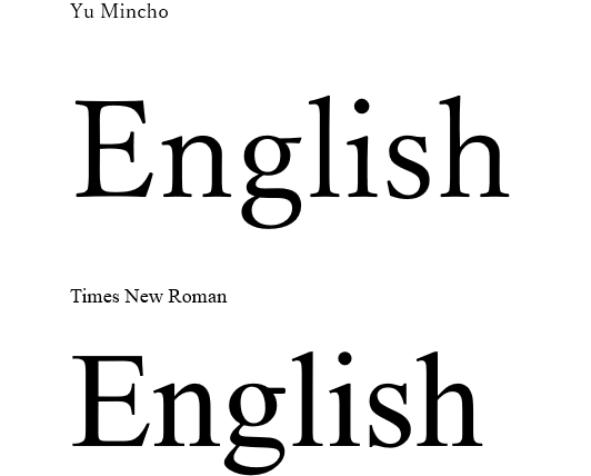
Notice how, like Times New Roman (serif font) Yu Mincho also has “feet” at the bottom. Yu Mincho (Japanese font) and Times New Roman (English font) are two examples that may appear identical at first glance. But let’s take a look at the text enlarged to size 120 and highlighted.
Figure 2
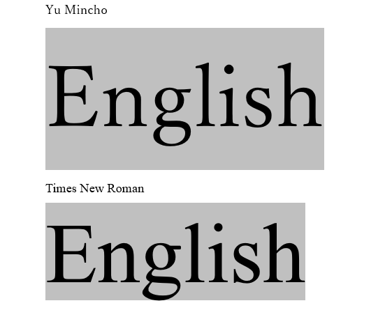
Notice the difference in the length and width of the gray boxes? Times New Roman is an English-optimized font with tighter spaces between each individual letter (also known as “kerning”), as well as above and below the letters. This may not seem like much for a single word, but imagine the amount of space this adds up to in a 100-page report!
Also notice how Times New Roman letters are slightly more rounded, while Yu Mincho is slightly boxier.
Let’s downsize the font and take a look at another example.
Figure 3
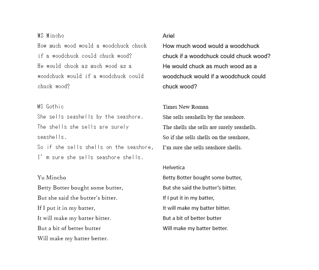
In this figure, I used three common Japanese-optimized fonts on the left side, and three fonts optimized for English on the right. All text in this picture is set to 10.5. The font choice is the only variable factor between each input.
Notice how the Japanese fonts on the left generally take up more space between each letter and line? The difference between MS Gothic and Times New Roman may be the most obvious, but notice how MS Gothic takes up a whole extra line.
Also notice how Times New Roman (serif font) feels more traditional and reliable than Ariel and Helvetica (sans-serif fonts).
Final Thoughts
Your font choice matters. It’s not just about aesthetics—it’s about ensuring your message is clear, professional, and optimized for your audience. Contact One World Link if you have any questions on font use
Next time you’re formatting a report, remember: your font speaks louder than words. Ask your publisher to consider the English version during the initial design phase, including font, text direction, and layout.
Additional Materials
Here is a great introductory blog on typography: https://www.toptal.com/designers/typography/typeface-classification
Here is a unique website that allows you to compare two English fonts at once.
http://www.identifont.com/differences.html
Jessica Azumaya
最新記事 by Jessica Azumaya (全て見る)
- Writing for a Global Audience - 6月 2, 2026
- What Makes Business English “Business”? - 5月 9, 2026
- How Effective IR Can Be a Competitive Advantage - 4月 10, 2026
- The Rise of Storytelling in the Era of AI - 3月 27, 2026
- Are You Using Incorrect English in Japanese Design? - 12月 15, 2025