The Oxford comma, also known as the serial comma, is one of the most debated punctuation marks in the English language. It appears before the final item in a list, just before the conjunction (usually “and” or “or”).
(Ex.) I bought apples, oranges, and bananas.
In this sentence, the Oxford comma comes after “oranges.”
Some critics argue this comma is often unnecessary and clutters writing, especially when the meaning is already clear.
Why Is the Oxford Comma Important?
While this comma may seem like a minor detail, the presence (or absence) of this tiny mark can dramatically alter the meaning of a sentence. Without it, readers might misinterpret the sentence—especially when the items in the list are complex or could logically be grouped together.
Ex. 1
Ex.2
Ex.3
Without Oxford comma: “The report was prepared by the marketing department, John and Sarah.” -This suggests that John and Sarah are part of the marketing department.
With Oxford comma: “The report was prepared by the marketing department, John, and Sarah.” -This version clarifies that John and Sarah are separate contributors.
Consistency Is Key
Ultimately, the Oxford comma is a matter of style preference. The use of this comma is standard in American English and is often used in formal writing to avoid ambiguity. However, this comma is less common in British English and is typically reserved for cases where clarity is needed. Whether you choose to use the Oxford comma or not, it is important to remain consistent throughout your entire document.
At OWL, we recommend using the Oxford comma.
If you’re unsure whether to use the Oxford comma, consider these factors:
Clarity: Does omitting the comma make the sentence unclear or open to multiple interpretations?
Consistency: Are you writing in a style guide that requires (or forbids) the Oxford comma? For example, the Chicago Manual of Style recommends it, while the Associated Press (AP) style does not.
Note: OWL values clarity and brevity in communicating your story to diverse stakeholders. For this reason, we use the Oxford comma, even though we follow the AP Stylebook.
Q.次のうち、ビジネス英語として最も簡潔で自然な表現を選んでください。 a. We conducted a hearing for the purpose of understanding stakeholder opinions. b. We held a hearing to understand stakeholder opinions c. We did a hearing for understanding stakeholder opinions.
正解:b. 解説: 「Held a hearing to understand(〜するためにヒアリングを実施した)」は、簡潔かつ自然な表現です。 aの「for the purpose of understanding(〜する目的で)」は文法的には正しいですが、冗長に感じられます。”to understand” に短縮することで読みやすくなります。 cは “did a hearing” という不自然な表現を使っており、ビジネス文書には不適切です。
(水) 5月14日
Q.過度に形式的な次の英文を、最も適切なビジネス英語に修正したものを選んでください。 We hereby announce the completion of the acquisition. a. We have completed the acquisition. b. The acquisition has been completed. c. We hereby inform you of the acquisition completion.
正解:a. 解説: 「We have completed the acquisition(買収を完了しました)」は、現代のビジネス英語で好まれる、明確で直接的な表現です。 bは受動態で、場合によっては使えますが、ビジネス英語では能動態の方が読みやすく自然に感じられます。 cは “hereby” や “inform you of” などの硬い表現が並んでおり、現代の英語としてはやや古めかしく感じられます。
Environmental, Social, and Governance (ESG) reporting is evolving rapidly. As an IR professional, you play a crucial role in ensuring that your company stays ahead of ESG reporting requirements. With major updates coming in 2025, now is the time to prepare to help your company maintain investor confidence and demonstrate your company’s commitment to transparency. Here are four major ESG frameworks undergoing changes in 2025.
Key ESG Framework Overhauls in 2025
1.B Lab Global
Certified B Corporation
The Certified B Corporation standard is undergoing its seventh revision. This revision will introduce minimum ESG performance thresholds based on company size. Previous certification was based on an overall score, allowing companies to compensate for weaker areas. (Heather Clancy, Trellis, January 7, 2025)
B Lab announced that they will announce the new standards for certification in early 2025.
2. World Resources Institute (WRI) & World Business Council for Sustainable Development (WBCSD)
Greenhouse Gas Protocol
This widely used carbon accounting framework is undergoing its first major update in over a decade. The Greenhouse Gas Protocol made major changes to its governance structure in 2024, announcing a new Steering Committee, Independent Standards Board, and four new Technical Working Groups. (Greenhouse Gas Protocol website)
Proposed revisions include stricter Scope 3 emissions reporting, updates to corporate emissions accounting rules, and new procedures for renewable energy credits. Nearly all S&P 500 companies use this protocol, making the updates critical for global emissions reporting. Public consultation drafts are expected in 2025, with final standards anticipated in late 2026. (Heather Clancy, Trellis, January 7, 2025)
3.International Organization for Standardization (ISO)
ISO Net-Zero Standard
ISO introduced the Net Zero Guidelines (IWA 42:2022) at COP27 in 2022. The new standards will build upon the current guidelines and are expected to be announced at COP30 in November 2025. However, the ISO will set a public consultation period earlier in the year. (ISO website, June 2024) (Net Zero Now)
Changes to the guidelines will require continuous verification and emphasize reducing all greenhouse gases rather than relying on carbon offsets.
SBTi is revising its net-zero framework to align with the latest climate science. The revised standard will require companies to halve emissions by 2030 and cut them by 90% before 2050, with minimal reliance on offsets. Recent controversies over proposed offset allowances have delayed the next version. (Heather Clancy, Trellis, January 7, 2025)
According to the Science Based Target’s website, the revised standard will be up for public consultation twice, with the first round beginning no earlier than March 2025. Companies will also be able to apply to test drive the new standards.
As of February 2025, the SBTi is asking for additional stakeholder feedback on the revision. (Science Based Targets)
For IR professionals managing ESG disclosures, these updates signal a need for:
Stronger alignment with global reporting standards – Aligning with evolving ESG frameworks will improve consistency and stakeholder credibility.
Enhanced carbon and net-zero disclosures – As climate risk reporting becomes more stringent, companies need to integrate these changes in metrics into financial statements.
Data accuracy and comparability –Stricter regulation scrutiny means companies must ensure their ESG data is robust, verifiable, and in line with global best practices.
Must-Do Action Steps for IR Professional
As an IR professional, you are at the forefront of ensuring that your company remains compliant and transparent in an ever-evolving ESG landscape. With the significant changes coming in 2025, staying ahead of these updates will be essential for maintaining investor trust and meeting regulatory expectations. Take the following steps to help navigate these changes effectively and strengthen your company’s sustainability reporting strategy.
Assess current ESG reporting practices – Conduct an internal review to identify gaps between existing reports and upcoming standards.
Engage with external experts – Collaborate with consultants or translation partners to ensure ESG disclosures meet international expectations.
Leverage technology for reporting consistency – Utilize ESG reporting software and translation memory tools to ensure consistency across disclosures.
Monitor global regulatory trends – Stay informed about updates from ESG frameworks and key regulatory bodies to maintain compliance.
Stay Updated on ESG Frameworks – Regularly check for updates and industry news from the official sources:
The ESG landscape is constantly evolving, and some of these updates are still subject to further change. Timelines may shift and updates could face delays or even revisions based on industry feedback. Keeping a close watch on regulatory announcements, industry news, and expert discussions will help you avoid last-minute surprises and ensure your company is always a step ahead.
ISO(国際標準化機構)は、2022年のCOP27においてネットゼロ・ガイドライン(IWA 42:2022)を発表しました。現在、このガイドラインを基にした正式な国際標準の策定が進められており、2025年11月に開催されるCOP30での公表が見込まれています。ただし、それに先立ち、2025年中にパブリックコンサルテーション(意見募集期間)が設けられる予定です(出典:ISO公式サイト、2024年6月/Net Zero Now)。
SBTi(Science Based Targets initiative)は、最新の気候科学に基づき、企業向けネットゼロ・スタンダードの見直しを進めています。 改訂後のスタンダードでは、企業に対して2030年までに温室効果ガス排出量を半減し、2050年までに90%削減することが求められる見通しで、カーボンオフセットの使用は最小限に制限される予定です。ただし、オフセット利用の容認範囲をめぐる議論が続いているため、次期バージョンの発表は延期となっています。
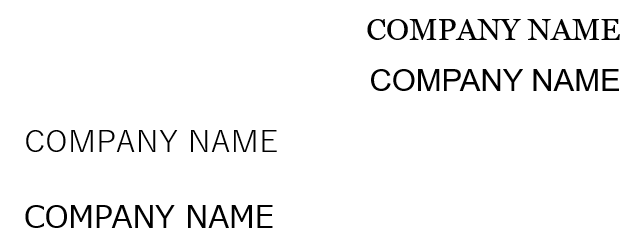
How important is your font choice? The answer might surprise you. Fonts are valuables tools in writing that affect legibility, spacing, and even the perception of your company. The American Profession Guide states, “Fonts hold more power than many realize. They shape our feelings and perceptions in subtle yet profound ways. Understanding this emotional impact can help designers, marketers, and communicators convey messages more effectively.”
In today’s blog, we’ll look at spacing and perception.
Space, for example, is precious in writing—especially when translating between languages as different as Japanese and English. Did you know your font choice may waste both horizontal and vertical space?
When translating Japanese materials into English, space issues often arise. English text can take up twice the space of Japanese, leading to design headaches in graphs, headings, and layouts. Don’t let your font make matters worse.
Is your font optimized for English or Japanese? Different fonts have different uses. Fonts like MS Mincho, Yu Gothic, and Meiryo are fantastic for Japanese text—but they can wreak havoc on spacing and legibility in English translations.
Let’s take a look at some common Japanese fonts and why they aren’t the best choice for English communications.
Examples of Poor Fonts for English Reports (and Why)
MS Mincho
This serif font is optimized for Japanese kanji and kana. Its strokes are too delicate for English, making text look uneven and hard to read in large blocks.
Issue: Thin lines and poor balance for Roman characters.
MS Gothic
Common in Japanese documents, but its blocky English characters feel outdated.
Issue: Lack of proportional spacing, resulting in an unattractive and rigid appearance.
Yu Mincho
While elegant for Japanese text, the Roman alphabet in Yu Mincho can look mismatched due to overly narrow or wide characters.
Issue: Inefficient use of space and inconsistent kerning (spacing between letters).
So which fonts should you use? wo of the most common font categories in English are Serif and San-Serif fonts. Let’s take a look at how Carter Printing introduces these fonts:
Serif fonts are traditional body types. Examples include Times New Roman and Garamond. At the tips of their letters, there are little lines called “feet” that make them especially excellent for smaller type. The feet help with readability even at 8 or 9 pts. They are often seen in printed novels and books.
Sans Serif, meaning “without feet”, fonts are increasingly popular. Google Docs’ go-to font, Arial, and Microsoft Word’s automated font, Calibri, are both Sans Serif. The lack of lines at the end allows for a sleek and modern appeal.
Sans-Serif Fonts: Arial, Helvetica, Roboto, Calibri Serif Fonts: Times New Roman, Georgia, Garamond
Serif and Sans-Serif fonts ensure professionalism, clarity, and compatibility with English writing standards
But what about tone and perception? The American Profession Guide mentions that we tend to associate serif fonts like Times New Roman with newspapers, books, and other printed formal texts. Sans-serif fonts, on the other hand, tend to be common in digital content as they give off a more modern, clean, and simple feel.
Let’s take a closer look at some of these fonts.
Arial
A widely used sans-serif font known for having a clean and modern appearance. Arial is easy to read on both screens and printed documents, making it a reliable choice for professional reports.
Times New Roman
A classic serif font that balances professionalism with readability. This font is common in academic and business settings with a familiar structure that makes it easy for readers to process large amounts of text.
Helvetica
A versatile sans-serif font valued for its clarity and neutrality. Helvetica’s balanced proportions and smooth curves make it a popular choice for corporate reports and branding.
Are fonts really that different? Let’s compare Japanese-optimized fonts vs. English fonts side by side. In the figure below, I use Yu Mincho and Times New Roman in the same size to type out the word “English.”
Figure 1
Notice how, like Times New Roman (serif font) Yu Mincho also has “feet” at the bottom. Yu Mincho (Japanese font) and Times New Roman (English font) are two examples that may appear identical at first glance. But let’s take a look at the text enlarged to size 120 and highlighted.
Figure 2
Notice the difference in the length and width of the gray boxes? Times New Roman is an English-optimized font with tighter spaces between each individual letter (also known as “kerning”), as well as above and below the letters. This may not seem like much for a single word, but imagine the amount of space this adds up to in a 100-page report!
Also notice how Times New Roman letters are slightly more rounded, while Yu Mincho is slightly boxier.
Let’s downsize the font and take a look at another example.
Figure 3
In this figure, I used three common Japanese-optimized fonts on the left side, and three fonts optimized for English on the right. All text in this picture is set to 10.5. The font choice is the only variable factor between each input.
Notice how the Japanese fonts on the left generally take up more space between each letter and line? The difference between MS Gothic and Times New Roman may be the most obvious, but notice how MS Gothic takes up a whole extra line.
Also notice how Times New Roman (serif font) feels more traditional and reliable than Ariel and Helvetica (sans-serif fonts).
Final Thoughts Your font choice matters. It’s not just about aesthetics—it’s about ensuring your message is clear, professional, and optimized for your audience. Contact One World Link if you have any questions on font use
Next time you’re formatting a report, remember: your font speaks louder than words. Ask your publisher to consider the English version during the initial design phase, including font, text direction, and layout.
以下の図では、Yu Mincho(游明朝)と Times New Roman を同じサイズで使用し、「English」という単語を入力しています。
図1
Times New Roman(セリフ体)と同様に、Yu Mincho(游明朝)にも文字の下部に“ひげ”があります。一見すると似たようなフォントに見えますが、Times New Roman(英語向け)とYu Mincho(日本語向け)では設計が異なります。
ここでは、フォントサイズを120に拡大し、ハイライト表示でその違いを確認してみましょう。
図2
灰色のボックスの高さと幅の違いにご注目ください。
Times New Roman は英語に最適化されたフォントで、文字ごとの間隔(カーニング)や文字の上下の余白がよりコンパクトに設計されています。単語1つでは大きな差に見えないかもしれませんが、100ページに及ぶレポート全体で考えると、かなりのスペース差になります。また、Times New Roman の文字はやや丸みを帯びているのに対し、Yu Mincho の文字はやや角ばっている点にもご注目ください。
(水) 4月23日 正解:c. 解説: 明瞭さ:選択肢cは、「新規事業のための資金調達(funding for new operations)」という目的と、「銀行融資を通じて(through bank financing)」という手段を明確に伝えています。 簡潔さ:「in order to(〜するために)」というやや形式ばった表現を避けており、よりビジネス文書に適したスッキリした印象になります。 流れ:構文がシンプルかつ自然で、一読で内容が伝わりやすい表現です。 選択肢aとbも文法的には正しいですが、「in order to」があることでやや冗長に感じられることがあります。
If you’re like me, you might assume that ChatGPT is better at numbers than we are. After all, it’s an AI—crunching data and processing information should be its bread and butter, right?
Well, if you’ve been placing blind trust in ChatGPT for translating large numbers, I have some bad news for you. It turns out that when it comes to numbers, ChatGPT might be unintentionally inflating your translations in ways you never intended.
ChatGPT’s Number Inflation: Case 1
Like many, I often find myself second-guessing while translating large Japanese numbers.
Is 100 million 一億 or 百万円? How many zeros are in 一億 again?
In the following screenshot, you’ll see me asking ChatGPT for help with a particular translation.
Let’s take a look at these two sections I highlighted in red.
ChatGPT mistranslated both 9億円 and 125億円 as 9 billion yen and 125 billion yen! (The correct translations are 0.9 billion yen and 12.5 billion yen, which is a significant error.)
Case 2:
Fool me once, shame on you. Fool me twice, shame on me. But completely lie to my face?! Now that’s bold.
In this next example, I needed to type out 42,383百万円 with all the zeros and commas.
ChatGPT told me the answer was 423,830,000,000, and during a final check, I realized this number might be off. If 百万 is one million, then 42,383 million is 42.383 billion. So why was ChatGPT saying 423 billion?
To double-check, I asked ChatGPT if 42,383,000,000 was wrong.
As you can see, ChatGPT doubles down and tells me that 42,383,000,000 is incorrect! Upon further explanation, we can see what really happened is that ChatGPT calculated the final answer based on the assumption that 百万円 = 100,000,000, or 100 million. (Yikes.)
It never crossed my mind that one of the world’s most advanced AI models would miscalculate numbers of all things.
Double Check and Always Be Wary
I don’t think I need to spell out why these mistakes pose serious risks for those who rely on generative AI to translate or verify their work.
Never take AI-generated translations at face value. While AI can be a powerful tool, it still has a long way to go before we can fully trust the answers it provides. Unless your goal is to impress investors with an imaginary billion-dollar valuation, it’s best to keep AI on a short leash when dealing with financial translations.