One World Link では、テーマ構成の整理、日本語と英語のメッセージの整合性確保、読みやすさの向上など、統合報告書およびESG関連資料の質を高めるお手伝いをしています。 無料の英語翻訳品質診断レポートもご利用いただけます。 https://www.oneworldlink.jp/satei.php
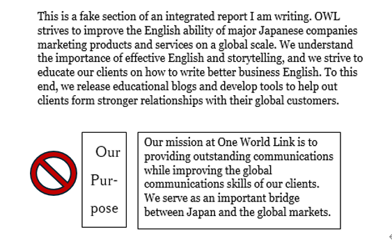
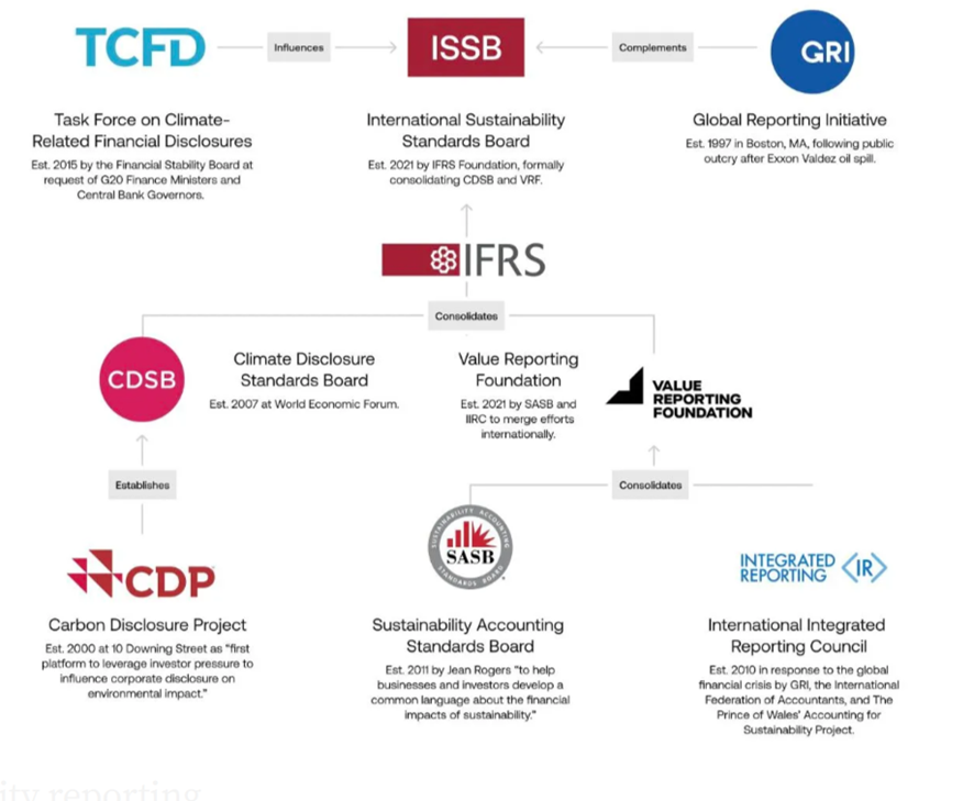
Our company adheres to multiple standards and recommendations, including the Task Force on Climate-related Financial Disclosures (TCFD) guidelines, the Global Reporting Initiative (GRI) standards, the United Nations Sustainable Development Goals (SDGs), the International Integrated Reporting Framework (IIRF), and the recommendations of the Sustainability Accounting Standards Board (SASB).
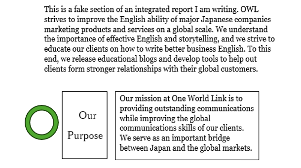
VS
Our company adheres to the following standards and recommendations: • Task Force on Climate-related Financial Disclosures (TCFD) • Global Reporting Initiative (GRI) • United Nations Sustainable Development Goals (SDGs) • International Integrated Reporting Framework (IIRF) • Sustainability Accounting Standards Board (SASB)
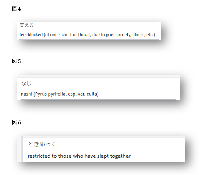
このように、非標準の訳語が公開されたまま訂正されない場合、それがAIの学習データに取り込まれ、“正しい訳”として出力されてしまう可能性があります。 これはいわゆる「Garbage in, garbage out(質の低い入力からは質の低い出力しか得られない)」という典型的な問題であり、AIが不適切な入力を学習すればするほど、今後さらに誤訳が増えていくリスクがあることを意味しています。
このような基準は、米国証券取引委員会(SEC)によっても推奨されています。SECは、投資家保護と企業情報開示の透明性確保を目的とする機関であり、難解な金融文書に対する懸念を受けて、1998年に「Plain English Handbook(プレーン・イングリッシュ・ハンドブック)」を発行しました。このハンドブックでは、「可能な限り短い文を使うこと」が推奨されており、簡潔な文章は理解を助け、特に法務・財務文書における誤解のリスクを軽減するとしています。
By leveraging our strengths in advanced technology and expertise accumulated over decades, while simultaneously addressing societal challenges such as climate change, resource scarcity, and demographic shifts, we aim to achieve sustainable growth and enhance corporate value by implementing initiatives aligned with our long-term management vision, which prioritizes fostering innovation, expanding global partnerships, and maintaining robust governance structures to ensure resilience in a rapidly evolving market environment.
調整した英訳 (複数の文)
We leverage decades of expertise and advanced technology while addressing societal challenges including climate change, resource scarcity, and demographic shifts. Guided by our long-term management vision, we prioritize fostering innovation, expanding global partnerships, and maintaining robust governance. These initiatives aim to ensure resilience in a rapidly evolving market while achieving sustainable growth and enhancing corporate value.
コーポレート・バリュー・レポーティング・ラボ(Corporate Value Reporting Lab)によると、統合報告書を発行する日本企業の数は年々増加しています。2015年には200社強だった発行企業数が、2023年には1,000社を超え、今後さらに増加が見込まれています(詳細はフルレポートをご参照ください)。