

(日本語ブログ:縦組みデザインは英語レポートの読みやすさを損なう理由|One World Link)
No one can deny that Japanese and English are about as different as two languages can be. From the seemingly “backwards” sentence structures to entirely different reading directions, the two feel like polar opposites.
Did you know English text can take up to twice as much space as Japanese? Imagine trying to cram all that extra text into tiny graphs, headings, or design elements. The struggle is real, and translators often need to get creative.
But today, I want to focus on one specific pain point that’s truly a headache—vertical text.
Vertical Text: A Reader’s Nightmare
Vertical text is a staple in Japanese design, but when it comes to English? It’s a recipe for confusion. Here’s why:
Reading Flow Disruption: English readers are used to scanning left-to-right, top-to-bottom. Vertical text forces them to pause and tilt their heads, breaking their rhythm. Some readers may skip the text altogether due to not being accustomed to such formatting.
Misinterpretation Risks: Vertical text and its placement can lead to misinterpretation in financial reports, manuals, or other complex documents as readers are accustomed to left-to-right flow. Vertical text may cause confusion about what data the label refers to or whether the information is a heading or a side comment.
Take a look at this example page I created from a hypothetical integrated report.
Figure 1
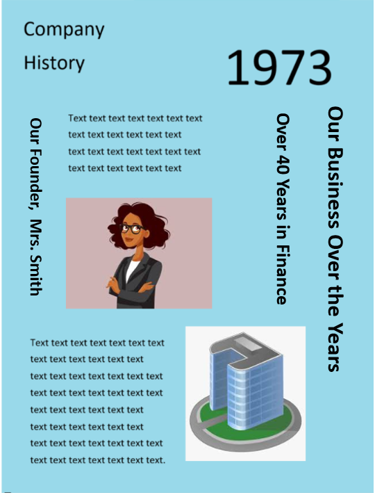
With excessive use of vertical text like this, English readers are almost forced to break their next to read your report.
(True story: I once had to edit an 80-page integrated report full of vertical headings just like this. Imagine trying to read 80 pages like this!)
One study posted in the Journal of Vision found that reading speeds of vertical text drops significantly compared to horizontal text. (Journal of Vision)
While readers may be inclined to force their way through a spot or two of vertical text, an entire 80-page report is another story entirely. Readers may decide that reading such material just isn’t worth the hassle.
Your readers—global investors—expect reports that are easy to navigate. Vertical text can slow down their understanding, making them less confident in your materials.
When Vertical Text Can’t Be Avoided
There will, of course, be times when vertical text is unavoidable.
Oftentimes, when text reaches the translation stage, it’s too late to make any major changes to the design.
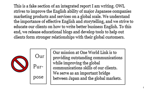
So what can you do? Let’s take a look at Figure 2.
Figure 2
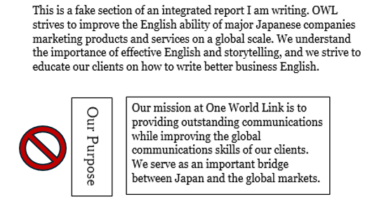
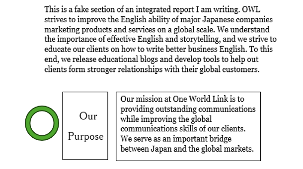
Notice how Our Purpose faces the outside of the page?
You may think this is the correct way to print vertical text in English, given that English text is read from top to bottom.
But as you may know, where there is a rule in English, there is almost always an exception.
If I underlined Our Purpose, that line would be facing the blank area, away from the text it should be heading. This makes it seem as if there is no relevant text under the title.
It’s best to rotate such text clockwise or counterclockwise to ensure that any unavoidable English text faces the relevant body text, even if it means not all titles face the same direction.
Let’s look back at Figure 1.
Figure 1 (Revised)
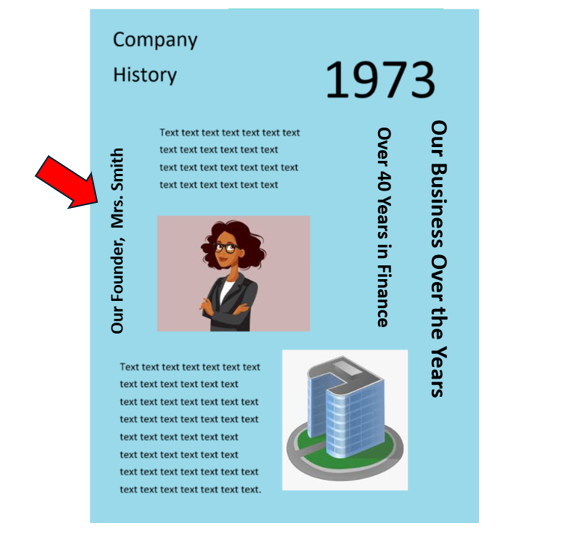
Even though the revised heading reads bottom to top and is different from the other headings, the heading now points to the correct information.
Tools like Adobe InDesign and Microsoft Word offer features to align vertical text more effectively. Use these to tweak layouts without redesigning from scratch.
Another option you may have is widening the space allotted and using horizontal text, but this depends heavily on space.
Figure 2 (Revised)
Only take this option if each word if you are able to do so without breaking up single words over multiple lines of text.
Figure 3
The Takeaway
Don’t lose readers to avoidable design flaws.
Remember: Your English-language report may be the first touchpoint global investors have with your company. If a label or title feels unclear, unnecessary, or awkward to read, readers may feel less inclined to continue reading and learn about your company.
Avoiding vertical text, or adjusting its orientation thoughtfully, isn’t just a design decision. It’s part of building trust. And for IR professionals, ensuring your reports meet global readability standards is essential. Take the time to audit your layouts and make small adjustments to vertical text where possible.
Before submitting your report, check for:
- Vertical text that disrupts reading flow
- Misaligned vertical headings
- Alternatives like rotating titles to face the relevant body text
And if possible, collaborate with your design team early to ensure layouts accommodate both languages. A small conversation now can save significant headaches later.
Jessica Azumaya
最新記事 by Jessica Azumaya (全て見る)
- Are You Using Incorrect English in Japanese Design? - 12月 15, 2025
- One Easy Way to Make Your English Writing Appear More Natural - 12月 13, 2025
- Why Using a Consistent Theme for Integrated Reports Strengthens Your Global Message - 12月 11, 2025
- Why Vertical Japanese Text Design Ruins English Reports - 12月 9, 2025
- Writing Is More Than ‘What’ You Say - 12月 5, 2025