

(日本語ブログ:「せっかく英語版のレポートを作成しても読まれない? 日本語から翻訳された英文レポートの落とし穴とは」|One World Link)
When preparing reports for a global audience, especially English-speaking stakeholders, it’s crucial to go beyond just translating content. The design and layout of your report can significantly impact readability and engagement. Japanese and English report styles often differ, and adapting your design to English conventions can make a world of difference.
Why Layout Matters
Imagine publishing your English report after months of back and forth with the translators, only for native readers to not read your report due to a poor layout. Or worse, your layout distracts readers from the real messages in your report, regardless of the translation quality.
Choosing the right layout can be as critical as the quality of its contents. Those involved in the designing and layout of the original Japanese report optimize text, font, tables, images, headings, spacings, and more to the original Japanese content. Why should the English version be different? Often, companies attempt to use the exact same layouts for English version, which turns into messy, hard to read English report that distract from the content.
For example, Japanese report designers often use vertical text in titles, headers, and even certain graphs and diagrams. English, however, is not so forgiving. Native English readers get tripped up by dense text, unusual spacing, or vertical text elements. A report that is difficult to read distracts from the key messages. That’s is why it’s important to keep the English translation in mind when designing your next report.
Let’s take a look at a few main issues that may arise if English translations are kept in Japanese format.
Poor Readability – Reports designed for Japanese include frequent vertical text. English readers are accustomed to left-to-right, top-to-bottom text flow. Vertical text or can disrupt readers from the main content.
Space Optimization – Japanese headings and text box labels may be as short as two Kanji character, but English text can take up to twice the space of the original content. Tables and charts with space optimized for Japanese can look cramped or overwhelming when translated into English.
Professionalism – A report styled with English design principles looks polished and shows attention to detail, enhancing your company’s credibility with overseas stakeholders. Japanese reports prepared for a Japanese audience and translated straight across to English often look poorly designed and thought out after translation.
So, What Makes for an English-Friendly Layout?
- Write the Japanese text knowing it will be translated into English
Long sentences, unclear subjects, needless prepositional phrases, and passive voice may be typical in Japanese reports, but these elements become roadblocks to understanding when translated. - Prioritize Horizontal Text Flow
Avoid vertical text or text blocks that require readers to rotate the document or their heads. Instead, arrange text in a left-to-right, horizontal flow. - Choose Fonts Thoughtfully
Use fonts optimized for English, such as Arial, Times New Roman, or Calibri. Avoid Japanese-optimized fonts like Yu Mincho or MS Gothic, which can make English text look unbalanced.
Let’s take a look at some of these fonts side-by-side. The following image shows the same paragraph from a Wikipedia article on Michael Jackson in three different fonts. On the far left I used Ariel, a common English-optimized font. The middle and far right columns show the same text at the same size with the same settings, but in Yu Mincho and MS Gothic fonts.
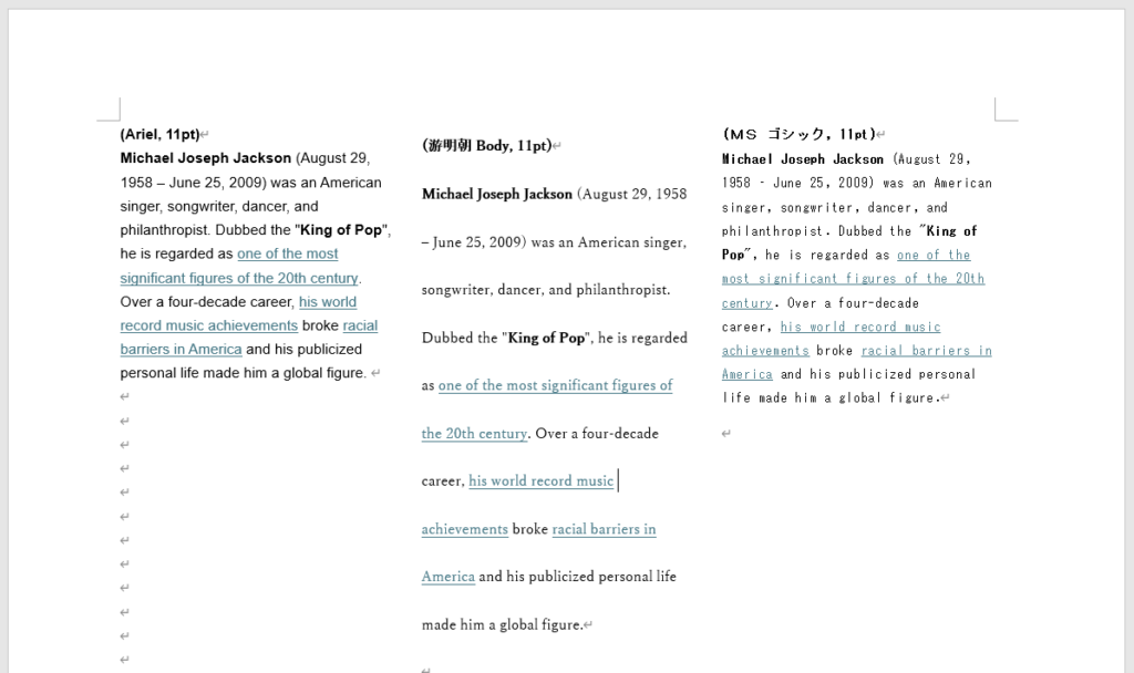
Notice how much space Yu Mincho uses with a single line break? Also notice the blocky letters and large spaces between the words with MS Gothic. Be conscious of how much vertical AND horizontal space your fonts take up! Choose fonts carefully.
4. Adjust Spacing Thoughtfully
Use generous line spacing and margins to prevent overcrowding and ensure headings and subheadings are distinct and visually clear.
5. Simplify Graphics and Tables
English layouts often use straightforward graphs and tables that prioritize clarity. Avoid overly intricate designs, labels, and text that may confuse readers. Often times intricate designs that looks good in Japanese look terrible in English.
6. Include Visual Hierarchy
Use detailed titles, bold headings, bullet points, and numbered lists to create a clear structure. This helps readers quickly scan and absorb the content.
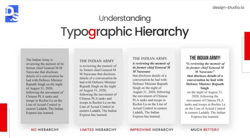
(Image Source: Design Studio UI UX)
7. Test for Mobile-Friendliness
Many stakeholders view reports on mobile devices. Ensure your layout adapts well to smaller screens without sacrificing readability.
Is it Worth the Effort?
Taking the time to design your reports with English layouts in mind shows your commitment to clear communication. It ensures your hard work doesn’t get lost in translation—literally or figuratively—and helps global stakeholders understand and appreciate your message.
Jessica Azumaya
最新記事 by Jessica Azumaya (全て見る)
- Are You Using Incorrect English in Japanese Design? - 12月 15, 2025
- One Easy Way to Make Your English Writing Appear More Natural - 12月 13, 2025
- Why Using a Consistent Theme for Integrated Reports Strengthens Your Global Message - 12月 11, 2025
- Why Vertical Japanese Text Design Ruins English Reports - 12月 9, 2025
- Writing Is More Than ‘What’ You Say - 12月 5, 2025