In our previous blog, we discussed a resurfaced video in which Peter Thiel, chair of Palantir Technologies, briefly discussed the level of impact the expansion of AI may have on people in math-related fields versus those in more writing-based fields.
We dived into a Wall Street Journal article that then discussed the rise in corporations searching to communicate more through “storytelling.”
Today, let’s take that discussion one step further and talk about why effective storytelling in investor relations can become a competitive advantage.
Why Narrative Matters in IR
Investors do not evaluate companies based on numbers alone.
Sure, financial metrics are essential, but investors also need to understand the strategy behind those numbers.
Studies show that investor relations communication and more frequent engagement can improve company valuation, liquidity, and institutional ownership. (*IDEAS / RePEc journal article)
In other words, a good narrative can influence how the market perceives a company.
This narrative is often called a company’s equity story and connects several key elements:
Business strategy
Competitive positioning
Growth opportunities
Capital allocation decisions
Long-term value creation
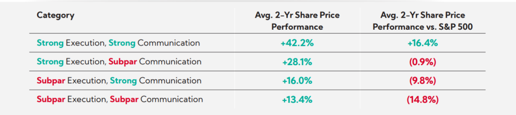
Let’s take a look at a report by Corbin Advisors titled Maximizing Valuation Through Strategic Investor Communication. Corbin Advisors is a U.S. company that provides strategic advisory services in investor relations and communications, supporting publicly traded companies in building sustainable shareholder value. In this article, the company highlights how important effective communication has become in modern capital markets.
Based on more than 24,000 interviews with the investment community, the research by Corbin Advisors suggests that roughly 40% of a company’s valuation can be influenced by investor relations and communication, either positively or negatively. The same study also found that companies perceived to combine strong execution with strong communication significantly outperform peers in share price appreciation. (Corbin Advisors PDF)
Corbin Advisors, Maximizing Valuation Through Strategic Investor Communication, 2025
In a market where investors follow dozens of companies at once and face an overwhelming amount of information, a clear and compelling investment story can play a major role in capturing investor attention and building long-term confidence. If you are interested in learning more, the full report is worth reading here.
The Growing Use of AI in Corporate Communication
In recent years, an increasing number of companies are looking to AI to cut costs and increase efficiency. In the world of investor relations, this shift can look like reducing personnel and internalizing translation by relying on AI tools or generative translation instead of outsourcing work to professional translators or communications specialists.
But relying on AI tools and generative translation in corporate writing runs the risk of companies losing their narrative and originality in repetitive, second-hand output.
At first glance, relying on AI and cutting personnel may seem efficient. AI tools can quickly generate English text from Japanese source material. They can summarize information and produce draft translations in seconds. However, there is a risk that companies relying heavily on AI may gradually lose their original voice and narrative.
When many organizations use similar tools and prompts, the output often becomes repetitive. Over time, corporate messaging can begin to sound standardized, generic, and indistinguishable from competitors.
The Hurdle of Japanese-to-English
Japanese and English are extremely different languages to translate between. From sentence structure to word choice, and even the tone of business materials, writing clear and effective communication takes more than direct translation.
Japanese business writing tends to rely on long sentences, indirect structure, and implied subjects. English investor communications, on the other hand, typically prefer result-first structures, clear subjects, and active voice.
Using large language models to translate often produces English that mirrors Japanese sentence structures. The translation may be technically correct, but the output frequently reads like a direct, one-to-one translation.
This type of English can be difficult for international investors to read. Following the Japanese structure too closely can make your message too hard to understand, resulting in less effective communication.
Another factor worth considering is the growing number of frameworks and guidelines used in sustainability and ESG reporting. Standards from organizations such as the ISSB, GRI, and TCFD often encourage companies to disclose similar types of information using similar terminology. As a result, sustainability sections in many reports can begin to sound almost identical once translated into English.
Following these guidelines is essential. However, you still have flexibility in how you communicate your message.
Clear and concise writing can often convey the same information in fewer words while highlighting your unique strategy and strengths. Communicating the same required disclosures more clearly and effectively than other companies can create an opportunity to differentiate your company in the eyes of global investors.
Differentiation Through Communication
Modern investors face an overwhelming amount of information, with institutional investors often following dozens of companies at the same time.
Companies that communicate clearly and consistently can stand out more easily in this environment.
Strong investor communication helps companies in the following areas:
Build trust with investors
Explain complex strategies clearly
Differentiate themselves from competitors
Attract long-term shareholders
Companies that invest in strong storytelling can therefore gain an advantage over companies that rely on generic communication.
The Plain English Approach
One practical way to improve IR communication is by adopting Plain English.
Plain English focuses on clarity and accessibility, and is a great choice when writing for a global audience effectively. This writing approach encourages writers to present information in a way that is easy for investors to understand.
Check out our previous blog on Plain English here, and stay tuned for upcoming posts where we take a deeper look at what Plain English is and how to apply it in practice.
In Summary
An increasing number of companies are looking to AI and generative translation tools for translation. But effective investor relations is not simply about speed and quantity—it’s about the quality of your message and differentiating your narrative from your competitors.
Companies that invest in effective communication and professional writing can strengthen investor understanding, build trust, and differentiate themselves in global capital markets.
実際、Wall Street Journalによると、LinkedIn上の求人において「storyteller」や「storytelling」といった語を含む掲載数は、過去1年間(2024年11月27日〜2025年11月26日)で倍増しました。記事掲載時点では、マーケティング関連の求人が約50,000件、メディアおよびコミュニケーション関連が約20,000件に達しています。
1. YouTube video Mercatus Center. (2024, April 17). Peter Thiel on political theology | Conversations with Tyler [Video]. YouTube. https://www.youtube.com/watch?v=vfbndRTlsg4
Recent data shows a clear rise in the use of the terms “storytelling” and “storyteller” in investor days and earnings calls among Western companies. Corporate job listings reflect the same shift, with more roles emphasizing storytelling as a required skill, even in an era increasingly shaped by AI. What do these companies mean by storytelling? What does storytelling have to do with you in your everyday investor relations work?
Some older comments on AI by Peter Thiel, chair of Palantir Technologies, have gained renewed attention over the past few months. In a discussion at the Mercatus Center on February 21, 2024, Thiel sat down with economist Tyler Cowen as part of the Conversations with Tyler podcast to discuss various topics from political theory to religion and AI.
The resurfaced clip from this interview shows Thiel stating, “It seems much worse for the math people more than word people. What people have told me that they think within the next 3-5 years, AI models would be able to solve all the US Maths Olympiad problems.” (*1)
In other words, Thiel theorized that the expansion of AI would affect those in math-related fields more than those in writing fields.
But why is this video resurfacing now?
While there is no single answer to this question, the video may be resurfacing due to a few factors.
In the U.S., AI has been a recent hot topic among banks and other financial institutions, with numerous companies announcing workforce cuts or the possibility of doing so due to AI in the near future. (*2) Furthermore, according to this Scientific American article (*3), certain AI models were able to solve five out of six questions during an unofficial 2025 International Math Olympiad test.
So, what about the “word people,” and do you even consider yourself “word people” as an IR professional? How does the expansion of AI affect those in corporate communications and other writing positions now?
In December 2025, the Wall Street Journal released an article on the importance of storytelling in corporate America. The article quotes numerous companies like Google and Microsoft that are searching for “storytellers.” (*4)
Specifically, the article states:
“Marketing and technology companies have often repurposed grandiose descriptions from other arenas to lend corporate office roles additional sparkle. While the heyday of technology gurus, developer ninjas, SEO rockstars and at least one digital prophet have long since passed, calling salaried communications professionals “storytellers” and the practice of storytelling appears to only have picked up in popularity.”
In other words, even as some question the value of traditional writing roles, companies continue to increase hiring for positions around storytelling. But what exactly is storytelling, and who are the storytellers?
Storytelling refers to communicating information in a way that connects ideas into a clear and engaging narrative, rather than presenting facts in isolation. Storytellers are the people who shape and deliver that narrative, deciding what to emphasize, how to structure information, and how to make the message clear and engaging for their audience.
In a corporate context, storytelling can be seen in the way we structure information to ensure that stakeholders understand the company’s strategy, performance, and direction as a coherent narrative.
Referring to this type of communication as “storytelling,” rather than terms such as “editorial” or “press relations,” has become increasingly common.
In fact, the Wall Street Journal notes that job postings on LinkedIn mentioning words like “storyteller” and “storytelling” doubled over the past year (Nov. 27, 2024 – Nov. 26, 2025). Listings for marketing positions were around 50,000 at the time of the WSJ article, while listings under media and communications came in at around 20,000.
The article also suggests possible reasons for this shift. Changes in how audiences consume information may play a role. Readers have moved away from traditional newspapers, and companies now communicate directly through their own channels, including social media.
These shifts may also influence how both audiences and companies approach communication, and in turn, how companies define and recruit for these roles.
FactSet, a financial data and analytics company, also reported an increase in the number of times the words “storyteller” and “storytelling” came up in investor days and earnings calls, with CEOs and companies also shifting away from terms “editorial” and “press relations strategy” to terms like “storytelling” and “content strategy.” (*4)
Jennifer Kuperman, chief corporate affairs officer of Chime, a financial technology company, says, “Terms like ‘editorial’ are limiting. They put in mind a very specific thing you’re doing or creating. Whereas you could tell stories in so many different ways—social, podcasts, putting your executives out there, hosting an event, talking to the press.” (*4)
Taken together, these trends suggest that companies increasingly view communication as a way to shape how stakeholders understand the business. For professionals in investor relations and corporate communications, this shift to storytelling raises expectations for how your company writes and presents English disclosures are written and presented.
The Takeaway
AI is evolving at breakneck speed, but increased reliance on AI also brings growing distrust and risks. Corporations appear to be turning towards more human and authentic communications to reach their target audiences, leading to a rise in demand for storytelling-focused roles.
While AI may be one step closer to solving the world’s most difficult math problems, as Peter Thiel previously suggested, humans are still an essential part of writing.
This shift places greater importance on how your company’s story is communicated in English. Disclosures must do more than present accurate information. They must connect key messages into a clear and coherent narrative in both the original and target languages.
At One World Link, we focus on telling your story to the world. Our Japanese-to-English writers support investor relations teams with professional translations that deliver clear, natural, and investor-ready narratives.
Reach out with any questions, and ensure your English narratives clearly support your story.
Citations
1. YouTube video Mercatus Center. (2024, April 17). Peter Thiel on political theology | Conversations with Tyler [Video]. YouTube. https://www.youtube.com/watch?v=vfbndRTlsg4
Do you use English in the design of your Japanese reports?
Whether you add English for branding, global appeal, or internal consistency across your disclosure materials, the final design should always be reviewed by a native English speaker before final publication.
Without that review, the English throughout your design may contain issues that only surface once translation begins. Revisions to the design at that stage can be extremely difficult and may affect both the Japanese and English versions of the report.
These challenges appear in many places, from katakana English to short English labels, English-based headings, taglines, and other forms of copywriting. Below, I dive into just a few of the most common examples we tend to see in Japanese IR and ESG reports.
Katakana English
Many English expressions in Japanese reports originate from katakana words or shorthand that work naturally in Japanese but do not carry the same clarity in English. Common examples include the following:
テーマ
Often mistranslated as theme. The translation depends heavily on context, but more accurate choices could include topics, discussion points, or focus areas.
インプット・アウトプット (Or similar headings)
Input and Output may be correct in certain contexts, but others require that these words take the plural form. Such Japanese words typically don’t take the plural form. Translating the katakana directly without confirming whether the context requires singular or plural can lead to confusion.
トップメッセージ
Top Message is a very common heading seen in Japanese reports, but it is not standard English for U.S. corporate communications. Natural alternatives include Message From the CEO or CEO Message, among other options.
While these translations aren’t necessarily incorrect, they can appear elementary, over literal, or even come across as a direct translation. When that English is already embedded into background elements or graphics, making adjustments becomes difficult. Early-stage consultation with a native English speaker or a trusted translation company helps prevent issues at the final production stage.
Typography
Typography is another important consideration when using English in Japanese reports. Fonts optimized for Japanese typography do not always handle English kerning or letter shapes well. Using English-optimize fonts is one way you can ensure your English looks professional across both Japanese and English reports. English optimized fonts can prevent wide kerning, unusual spacing, and inconsistencies between the Japanese and English versions of the report.
Below is an example of a single phrase using four different fonts. On the right side, I use Georgia and Arial fonts (English-optimized), and on the left side, I use 游ゴシック and メイリオ.
Notice how the spacing between each letter is slightly wider in the Japanese-optimized fonts. This spacing is called kerning. English becomes more polished when kerning remains tight and balanced. Japanese fonts also use wider ledding—the space between lines—to accommodate the taller structure of kanji and kana. Wider ledding can create unnecessary vertical space when the same font is used for English paragraphs.
Using English inside Japanese-language reports can strengthen your global image, but only when the English is accurate, natural, and typographically appropriate. Literal or improperly formatted English often needs revision during translation, and those revisions become difficult when the original layout has not accounted for English structure or typography.
Planning for English from the beginning improves both versions of the report. Clear, consistent English supports investor understanding and reflects the professionalism expected in IR communication.
One World Link can help review your English for Japanese layouts before reports reach the translation stage. Contact us today!
Direct translations of Japanese lists or items within the same hierarchy often overlook a crucial detail in English writing: parallel structure.
Parallel structure means aligning the grammar and form of each item in a list or group to ensure consistency. Literal translations of such items may reflect the original Japanese structure, but a lack of parallel structure can feel confusing or jarring in English.
High-quality English requires more than accuracy. A clear and consistent structure guides readers smoothly through key points, helping global audiences understand the information without hesitation.
Non-Parallel Structures
At OWL, we often see Japanese reports use non-parallel structures in lists and groups of phrases. Using a mix of verbs, nouns, gerunds, and other parts of speech in the same list may be acceptable Japanese writing, where readers can typically understand the message based on context. But English does not work the same way.
Inconsistent structure appears uneven and reduces readability, leading to communication issues in investor relations documents, where clarity and consistency are essential.
Take a look at the following Japanese-language example.
How would you translate this list? A direct, non-parallel translation might look like the following:
Take a look at item #3. Unlike the first two items, the phrase environmentally friendly activities does not include a verb. A missing verb here can be jarring to English readers, who may wonder what action your company intends to take regarding these activities.
Do you intend to engage in environmentally friendly activities? Increase participation in such activities? Start engaging? Continue current activities?
Ensuring parallel structure can support quick reading, reduce misinterpretation, highlight priorities clearly, and build trust through polished communication.
Items Within the Same Hierarchy
Items within the same hierarchy do not always appear as lists. A good example of this is a company’s materiality. Materialities have become a common reporting element across sustainability reports, ESG disclosures, and IR documents.
When laying out each materiality, ensure each item follows the same tense and grammatical structure, even if located in various similar areas throughout your report.
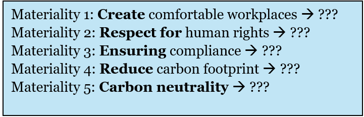
Let’s take a look at the following materialities.
Does each materiality use parallel structures? Or can you identify a mix of plain verbs, noun phrases, and gerunds? If there is a mix, how might you fix it?
If you answered that the materialities are not parallel, you would be correct. But how can you best fix this issue?
There are three simple approaches you can take.
Convert all plain verbs and gerunds (verbs taking “-ing”) into noun phrases
Convert all noun phrases and gerunds into plain verb phrases
Convert all nouns and verb phrases into gerunds
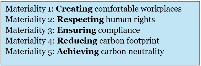
Let’s take a look at the following edited materialities.
Would you say the items in this group are parallel? The correct answer is yes.
Note that in my revision, I changed all forms into “-ing” verbs. Whether you revise your list to begin with plain verbs, “-ing” verbs, or nouns can boil down to preference, style, and even context.
The Takeaway
Literal translations can miss structural signals that matter in English. Ensuring parallel structure in English translations can lower miscommunication and ensure the intent of the Japanese is translated clearly.
Parallel structures across lists and items within the same hierarchy can also create a polished tone that supports trust and credibility with global investors through a clear structure that strengthens your message.
For support in creating consistent English writing, contact One World Link today
Integrated reports and sustainability reports carry significant responsibility in telling your story to a global audience. These documents communicate strategy, purpose, and progress to both domestic and global stakeholders, and every section contributes to the larger story that your company wants to tell. The key to shaping the story readers take away is the theme, or overarching message, that guides them through the report.
A theme isn’t just a cool slogan on the cover of your report. Instead, a theme should support your company’s values, philosophy, and the message of your overall report.
When the theme shifts from section to section, readers can struggle to understand the overall direction. Using a consistent theme will help keep your reports coherent and create a clear message investors can follow from the first page to the last.
A consistent theme can also only improve readability and enhance credibility. Investors expect companies to communicate with clarity, and a strong theme demonstrates intention and alignment across the organization.
Themes Across Sections
Consider the following example headings commonly found in an integrated report.
Cover Innovation for Growth
CEO Message Creating Stakeholder Value
ESG Section Building a Sustainable Future
Looking at these headings, readers might assume that each section discusses a different concept. Although all three sections may introduce valid talking points, the shift in focus can distract readers and make your report feel fragmented.
Below is an example of what a more consistent theme might look like, centered around the theme of innovativegrowth.
Cover Innovation for Growth
CEO Message Innovative Growth Builds Shareholder Value
ESG Section Innovative Growth Leads to a Sustainable Future
These revised section headings now link each message back to a single theme, creating not only consistency throughout the different sections but also strengthening the image that your company is fully dedicated to innovative growth.
When each section develops the same core idea, the entire report feels more intentional. Your theme supports the strategic story, and readers can see how leadership, ESG initiatives, and long-term ambitions connect to the company’s growth narrative.
This article on Storyraise (run by Storyraise Technology Inc.) discusses a multitude of reasons why developing a theme for your integrated report is absolutely crucial. In particular, Storyraise comments on the following benefits.
Themes…
Help tell a story
Humanize your brand
Help deliver an impactful message
Help you and your readers stay on track
Help affirm your brand
Help differentiate your report from years past
The article also states that without a theme, “…readers won’t feel like they’re reading a story. Instead, they’ll feel like they’re reading a textbook or a boring financial report.”
In Summary
Strong IR and ESG reports rely on a clear thematic direction. When each section supports a consistent idea, the writing carries a stronger message that resonates more deeply with readers and strengthens your global message.
One World Link can help refine theme structure, align Japanese and English narratives during translation, and improve readability across your IR and ESG materials. Contact us today for a free English Translation Quality Assessment Report (https://www.oneworldlink.jp/satei.php).
One World Link では、テーマ構成の整理、日本語と英語のメッセージの整合性確保、読みやすさの向上など、統合報告書およびESG関連資料の質を高めるお手伝いをしています。 無料の英語翻訳品質診断レポートもご利用いただけます。 https://www.oneworldlink.jp/satei.php